TAGC Back from the conference and working at last:
The Allied Genetics Conference is over. I came back utterly exhausted and now more than a week later offer you most of the poster I was displaying.
COMMENCE MOST OF POSTER:
Epigenetic effect of kinship on fertility of flies (Drosophila melanogaster) modeled by folic acid
by Linton Herbert MD (Pinellas County Health Department)
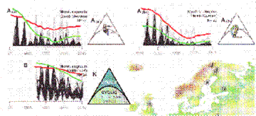
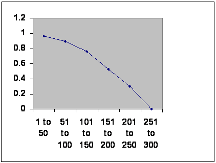 Western civilizations and East Asian dynasties usually face a roughly 300 year maximum life. This is a graph of ages of empires against their survival chance for the
50 years, NOT the number remaining.
Years on abscissa.
Information taken from R. H. Carling THE WORLD HISTORY CHART International Timeline Inc. Vienna, VA 1985.
This pools Rome, the classical Mayans and the Anasazi.
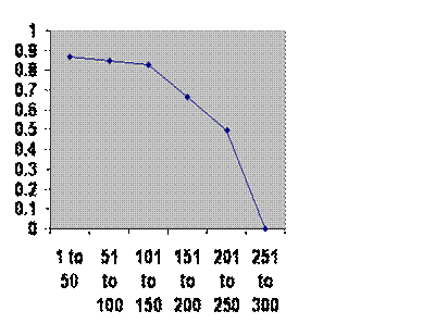
Information taken from BBC and Tainter. Same axes.
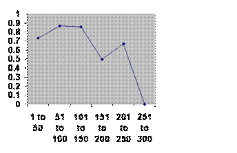
Chinese Dynasties:

Information taken from John B. Teeple TIMELINES OF WORD HISTORY, DK Publishing, New York, NY, 2006, page 554, 555 Chinese dynasties. The vertical axis is the chance that a dynasty of that age will survive another 50 years. The horizontal axis is the age of the dynasties.
Japanese dynasties:
Information taken from John B. Teeple TIMELINES OF WORD HISTORY, DK Publishing, New York, NY, 2006, page 554, 555 Japanese dynasties. The vertical axis is the chance that a dynasty of that age will survive another 50 years. The horizontal axis is the age of the dynasties.
If dynasties and empires fell because of internal factors selection would drive the line up. If the fell because of external factors survival would be independent of age and the line would be horizontal. The line goes down, so the only thing left is that they fall because of the very fact of a large population. This is explained in three steps.
Consider a new niche and two animals in marginal niches that might exploit it, they will begin to optimize for it:


One will get there first and the other may go extinct so
1) selection is a race.
Now suppose on species undergoes speciation:
One new species can remain optimized for the old niche and one be efficiently selected for the new. What’s worse, while the species in red is displaced, another may undergo speciation and take its old niche. I could go extinct even though its niche never changed so 2) speciation is a race.
Now consider a valley with animals and two closely related chromosomes. The valley is cut by a glacier that lasts 2,000 generations or whatever the time to speciation:
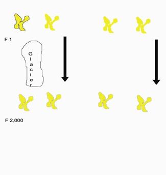
The chromosomes cannot form fertile offspring.
But now suppose the population in the valley rises to 1,000. That’s 2,000 chromosomes, so it takes (ruling out new members entering and ruling out genetic drift, so every chromosome survives every generation) 2,000 generations for the two in question to find each other. They cannot form a fertile offspring and the whole valley full dies out. Genetic drift does occur, but it won’t throw the calculation off by as much as a factor of 2 so 3) rapid speciation comes at a cost: population size must be controlled. Civilizations ignore the rule; that is why we die out. (R. Fox, “[Marry in or Die Out]” in Handbook on Evolution and Society, J. Turner, R. Machalek, A. Maryanski, Eds. Paradigm Publishers, Boulder, 2015), chap. 19.)
Obviously there is strong selective pressure to control population size. What nature has come up with is this:
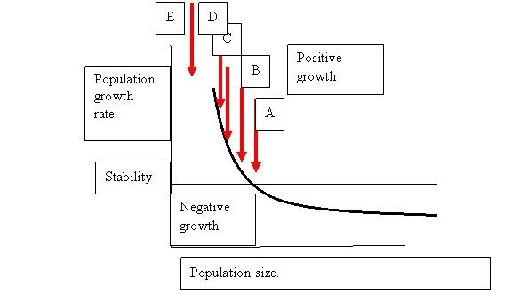
From “On the Regulation of Populations of Mammals, Birds, Fish and Insects,” Richard M. Sibly, Daniel Barker, Michael C. Denham, Jim Hope and Mark Pagel SCIENCE vol. 309 July 22, 2005 page 609
There are no units so that we don’t commit ourselves on numbers we do not know. What Sibly and his team did was to amass more than 1,000 serial field counts of animals and compare population growth with population size. I have taken the liberty of drawing one of his graphs.
It isn’t just animals. The same curve has been described in humans in Iceland, looking at children:
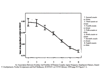
An Association between Kinship and Fertility of Human Couples Agnar Helgason et al. SCIENCE vol. 329 no. 5864 February 8, 2008 page 813 – 816 The vertical line is number of children “normalized,” compared with the average for the country. The horizontal line is kinship.
And grandchildren:
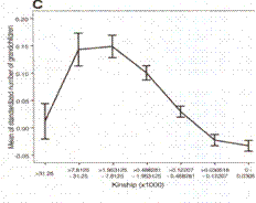
An Association between Kinship and Fertility of Human Couples Agnar Helgason et al. SCIENCE vol. 329 no. 5864 February 8, 2008 page 813 – 816
And in Denmark considering family size and marital radius (distance between birthplaces of couples).
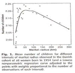
Taken from Comment on “An Association between Kinship and Fertility of Human Couples,” Rodrigo Labouriau and António Amorim, SCIENCE vol. 322 no. 5908 December 12, 2008 page 1634. For the whole story also see Human Fertility Increases with marital radius. Rodrigo Labouriau and António Amorim. GENETICS volume 178 January 2008 page 603
The line looks different because he used distance. Square the distances for area and you get the same curve. The team found that once factors influencing kinship were taken into account there was no effect of education or income on birth rate.
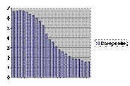
If you have a population just at A in the drawing, it will be stable. What that number actually might be is unknown for humans or any other animal. It can be seen in effect from counts of mice in Australia monitoring mouse plagues:
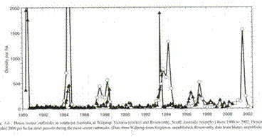
G. R. Singleton, C. J. Krebs, “The secret world of wild mice” in The Mouse in Biomedical Research, J. G. Fox, M. T. Davisson, F. W. Quimby, S. W. Barhold, C. E. Newcomer, A. L. Smith, Eds. (Elsever, Burlington, ed. 2, 2007), vol. 1, chap. 3, p. 39.
Usually the population is low and stable.
Displace the population slightly (we shall consider only smaller populations) to B, and it can recover by damped oscillation. This has been seen by computer model:
In the lab:
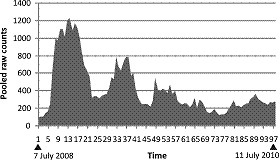
M. L. Herbert, M. G. Lewis, Fluctuation of fertility with number in a real insect population and a virtual population. African Entomology 21, 119-126 (2013).
Time course of a population of captive fruit flies.
And in the wild among European voles:
T. Cornulier et al. Europe-wide dampening of population cycles in keystone herbivores. Science 340, 63-66 (2013). Counts on the vertical axis, time on the horizontal.
The hallmark of this is the rapid rise and slow fall.
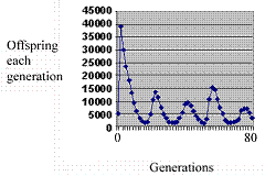
Push the initial population farther, to B, and there is a double peak ending in extinction. This has been showed with the computer program:
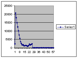 Population on the ordinate, generations on the abscissa.
Because of unrealistic starting conditions the first peak is anomalously high. The hallmark is slow rise and rapid fall. This pattern is only seen with a combination of pre-zygotic and post-zygotic mechanisms. The double peak is visible twice among those counts of wild mice shown above.
And in humans:
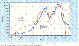 Time horizontal, tree rings blue and population by occupied houses red. Jared M. Diamond, “Life with the Artificial Anasazi,” NATURE, vol. 419 no 6907, October 10, 2002 p 567
I am assuming people only move in when there is a step up and are never caught leaving. The lower peak is about 800 and the valley about 600, so taking a middle number, and assuming 7 per household, our magic umber of balance should be about 100 families.
Farther to the left is a single peak shown in the lab:
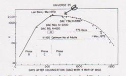
History of population of mice in a closed Utopian universe. Solid line is actual counts. J. Calhoun, Death squared: the explosive growth and demise of a mouse population. Proceedings of the Royal Society of Medicine 66, 80-88 (1973).
By computer:
I ran two cycles together trying to duplicate the Long House Valley data. 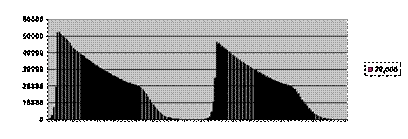 Vertical population, horizontal generations.
And in humans these are UN numbers for total fetitility of the whole world broken down by wealth.
Not forgetting the Danish lack of effect of education or wealth, we follow the yellow line until it is the level of the red, skip back and so forth.
Same graph edited version.
I can no longer find the data, it’s total fertility not birth rate and it’s discontinuous time, so lets call it a tentative suspicion, not data, but it may be the slow descent and leveling off of a post-zygotic mechanism.
And then of course there are the counts of wild mice, the big plagues are probably single peak plagues with local extinction and then mice coming in from outside.
Since the oscillations are too fast to be DNA mutations, they must be from an epigenetic process.
END POSTER FRAGMENT:
I went on a bit longer with original research results, but I hesitate to post them even on this tranquil site, since journals like to have the glory of being the first source. What you have, you have mostly already seen, but I think it’s a little more organized this way.
I trust the pun has not escaped you. I had been there a day before the penny dropped. The acronym stands for thymine, adenine, guanine and cytosine, the four bases that encode the information in the DNA double helix. Of course they also stand for The Allied Genetics Conference. Needless to say, the pun was too cute to resist and there were fully ten organizations that had meetings there at the same time. The hotshots, whom I so much wanted to meet, were never where I was. I suspect they were hobnobbing, which is most understandable, since it was a unique chance for all of them to get together.
Well the whole thing was an outside shot anyway, so I expected that and cannot claim to be disappointed. There is an insects meeting in September, and they have most surprisingly given me a chance to speak. Now if I can only get some people to come to my talk.
There have been 48 visitors over the past silent month and 250 people have run through “Babies Triumph over Evil” on YouTube.
Home page
.